Site usage
How to use it
This site contains working components for web browser based applications along with their code, documentation, and guidelines. If you are a designer needing some more guidance, or a developer coding for a native iOS or Android app, please see our Banner Atria design system Figma libraries. Here you will find information that relates to our design files and have the ability to inspect individual components and styles.
Banner Atria is specifically for use with digital products. It is not a brand guide. For Banner Health's brand guidelines, please visit our Brand Portal.
Individual component controls:
Below is an example of a button component and its controls.
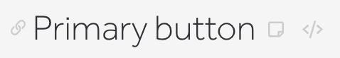
- Click the link icon to the left of the component title to jump to that component on the page. The URL bar in your browser will now show the direct link to that component, which can be used for sharing.
- Click the sticky note icon to the right of the component title to show the notes for each component. These notes will include optional classes, states, and other useful info.
- Click the code icon to the right of the component title to show the HTML, SCSS, and JavaScript used for each component.
- The functionality for showing the notes and code can also be changed globally, by clicking the icons in the left sidebar, below the navigation links. To permanently keep notes and code turned on, bookmark this link: https://bhdgwebdesignsa.z22.web.core.windows.net/?code=t¬es=t
For full use of all components of the design system:
- In the root of your project, create an assets folder. Download this toolkit, and place it in this folder. It includes all necessary CSS, JS, images, and fonts: Download Zip
- Include the following stylesheet reference in your
<head>tag
<link rel="stylesheet" href="assets/toolkit/styles/toolkit.css">
<!-- OR -->
<link rel="stylesheet" href="assets/toolkit/styles/toolkit-min.css">- Include these commonly used webfonts in your
<head>tag as well:
<!-- Effra font -->
<link rel="stylesheet" href="https://use.typekit.net/svc0cnr.css">
<!-- Utopia font -->
<link rel="stylesheet" href="https://use.typekit.net/yyn6exc.css">- Include the following script reference before your
</body>tag
<script src="assets/toolkit/scripts/toolkit.js"></script>
<!-- OR -->
<script src="assets/toolkit/scripts/toolkit-min.js"></script>- Optionally, you can also download the individual component-based Sass and Javacript files, if needed: Sass files JS files
- Use the HTML code provided with each component on this site
If you only need one or a few components:
- Use the HTML, Sass, Javascript, and images provided with each component
- Some components contain other components within them. This will be noted by Other components needed in the notes for the component.
- You may need to include the fonts using the instructions above if the component's styles reference it
- Include the following color and font Sass variables or CSS custom properties in your stylesheet, as most components reference them. Also include the below CSS reset styles.
- The color variables and their HEX codes are also available on the Colors page for quick and easy usage.
CSS variables (custom properties)
CSS reset
For information about adding components to this design system, see the developer docs.
© Banner Health