Introduction
Banner Atria
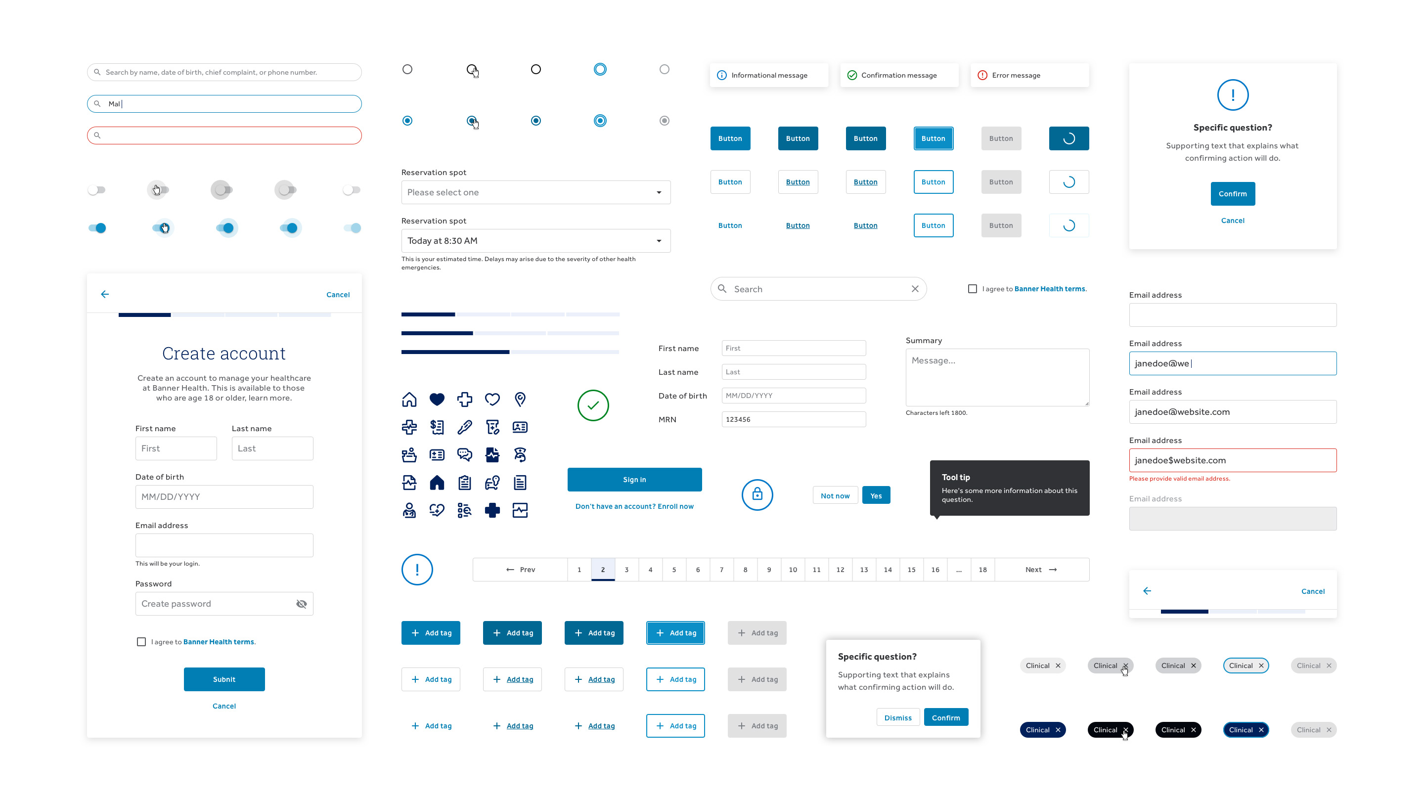
A design system that provides the foundation to produce cutting edge, intuitive, digital products and experiences for Banner Health's patients, customers, and workforce.

What is a design system?
Banner Atria is a library of concepts and ideas that drive how we build digital products. It is a single source of truth for a library of reusable, flexible, accessible components and styles. This library is accompanied by clear standards and guiding principles. Together these elements make up the design language for how Banner Health delivers digital products across a variety of channels and devices (web, native, voice, text, chat to name a few).
Banner Atria is not this site, or the components in it, rather it is the system of ideas and concepts that drive those elements. Its true value is in the products made from it, and is evident by the experience our users have as a result.
What's in a name?
From the word atrium. In both architectural and anatomical contexts, the word denotes a central joining place that allows in and out flow. Banner Atria is not only a single source of truth, but a living ever-changing system. As digital products evolve, new reusable components, patterns, and ideas emerge and can be introduced back into the system, much like the function of atria in a heart.
Why? User experience consistency
Using a centralized visual language helps deliver a better omni-channel user experience across brand touch-points on various channels and devices. We aim to deliver consistency in our products’ core functionality, information and messaging, look and feel, and tone of voice. We do this while still leveraging familiar UI patterns and conventions optimized for the users’ devices.
Why is all that important? When information and messaging appears on multiple channels, but doesn’t match, it communicates brokenness. As a user interacts with Banner, they may change channels out of convenience, habit, need or any number of reasons. Consistency in these areas helps establish a cognitive connection between various interactions on multiple channels. This facilitates learnability, user efficiency, and builds trust and credibility.
Why? Efficiency & quality
Producing products will be faster by solving common problems once and not the same problems over and over. Time saved on eliminating repeated efforts can be reallocated to increase quality and deliver better experiences. Building products with a design system results in higher quality output with future friendly accommodations. Global changes can be made across products easier. Using a shared vocabulary keeps teams in sync with how Banner makes products, even if teams are not necessarily connecting with each other.
How it's built
The library includes branding elements, UI elements, and UX patterns. In some cases messaging or information are built right in. Colors, type styles, and graphic styles provide the foundation for these and future components.
The design system is organized using the Atomic Design Method by Brad Frost. This is a modular approach that provides a deliberate hierarchical method to organize these building blogs with categories like Atoms Molecules and Organisms. Each type of component is built using the smaller components before it.
© Banner Health